I started this for the learning together event, but as life goes, I couldn't finish it in time. Nontheless, I finished it today and I hope it helps you to improve your skills in this area. if there is anything unclear, let me know!
At first I need to say that I use mainly two programms when working on any kind of resource for RPG Maker:
Gimp
This is the program i use for drawing, most tileset edits, recolor works, anything that includes transparency. I know that there are many other options, but this was the first graphic programm I used besides MS Paint and I had no reason to switch to another one so far.
Graphicsgale
As most of you probably know Gimp, this is not as common as it I guess. But I love it. It is - to me - simple and perfect for pixel art. So whenever it comes to pure pixel art, this is my choice. For some graphics I open both programms and make some steps here and some in Gimp.
MS Paint
Not one of the two main ones, but an honourable mention. The first year or two when doing edits, I only used this one. Seriously. Sure, it is limited, but for some simple things it can totally do the job. I still use it sometimes to sketch furniture.
The base
When you want to start doing tiles, it is not very clever to start with drawing everything from scratch - you need a lot of practise to get excatly where you want, and it is important to get a feeling for the style, the proportions, the structure, the light on the objects and everything else.
As I mentioned, I still use MS Paint for some scetches, and for this object, I did as well:
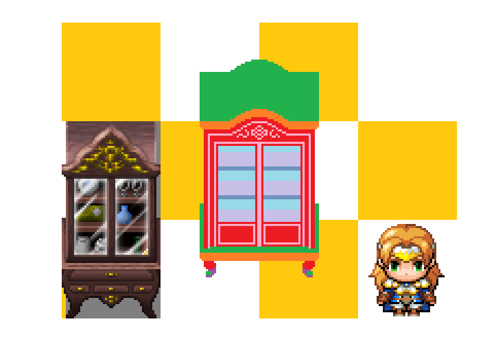
There are several things you can see in this picture, that help you with getting a pleasant size for your object:
A similar tile: Never loose the focus of what you are going to make. Your work probably won't be a standalone thing and just be in an otherwise empty map, so if it is important, to keep it in a realistic size compared to other similar objects.
A char: Same as with the object. I know that the proportions of the chars are not very realistic, but you should still avoid that they look like hobbits next to your tiles.
A grid: The object will somehow be placed somewhere. If you want to make it possible to put other objects on it in the editor or want it to have a realistic distance from the wall and still a height that isn't larger than the normal 2 tiles wall, a grid is your best friend.
Now, even though it is the very first step, you can already see what I am going to create: a nice cabinet for your RMMV char's living room.
An easy but clean scratch can help a lot to get everything right in the end. If you thought about everything in the scetch, you wont forget to add it later.
In this case:
Green
Both stared as just green rectangles of the same size. The upper one was slightly edited, but just by moving some pixels, not by adding or deleting them. This way the two areas have the same hight and widht.
Orange
Never forget that every object has a depth unless it is a plain paper, and so have our two green areas. I gave them slighly rounded corners just for the looks.
Red
Our plain front
Every other color was used for certain details, like the shelves inside of the cabinet or some decoration on the outside. That all was drawn in paint and it will become really important, that the areas are plain colors.
The structure
Our cabinet is made from wood, but what if we can't draw that structure properly?
No problem at all, you just have to go through the tiles and search for a structure you can reuse.
Things that help with the choice:
If you are a beginner, search for huge or best seamless structures, as in autotiles. I can look horrible if you see the places where the structure didn't loop in the final object.
If your object has to go with certain other tiles, use these as sources for the structure of possible, yours will stand out less in the end.
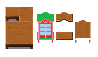
I used one of the best and easiest choices, the table autotile, here.
The two green areas and the orange ones were easily covered by some easy copy and pase work using the table top. The "bump" in the upper part was created by just moving around the pixels as well.
The front is just the plain structure rotated by 90°.
You maybe ask yourself you I got the parts cut out that perfectly?
Well, From now on I work in Gimp and my lowest layer is always my clean sketch. If I want to work on a certain area of the object, I just select that part there and work on other layers with that selection.
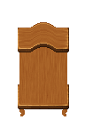
I have three layers right now,sketch, front and tops, this is how it looks like at the moment in total:
 Light, details and everything else
There is no certain order on what to work first, so I stared with the "bump" in the top.
In RPG Maker MV light comes from the upper left corner and so the the left part of the bump is going to be lighter than the right one. I selected the green area on the lowest layer, then I just selected the "bump" with the rectangle selection than then played around with the dodge/burn-tool.
Before I did this, I smoothed out some of the edges, not by using a tool put by placing few pixels with a color between the highlight and the base color to make the bump look more "natural".
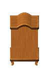
Now we have to keep in mind: Our light comes from the upper left and out front has the same tone as the top! Fixed within some seconds and already much more depth:
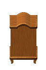
Time to take care of the details. I selected the pinkish area in my sketch and kept playing with the dodge/burn-tools. The rules keep being simple: the light comes from upper left, so everthing that is closer to the light than the front gets toned up, what is more distant gets toned down. As you see I made a mistake with one line that was fixed until the next step.
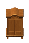
Where the area is not plain or where there are several parts of an object on several layers there are shadows. Now I selected the front - but
not the details pink color! - and addes shadows where is was necessary - as below the top and next to the darkened details.
This was taken further here. I added more contrast to the details as well and added a shadow to our bottom as well. Also Iadded outlines or the front and added contrast to the feet (using the shaped in my scetch and toning these areas up and down)
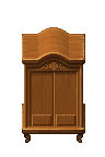
The I simply cut out the parts where we see through the doors:
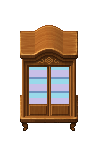
For the background I just added a plain color, we won't see much of it in the end anyways. The boards are again just parts of the tableto, with some shadows added on the left.
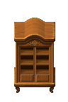
Noone (or... most people just don't) have an empty cabined in their living room, so time to fill it with stuff. For this I simply copied some stuff out of the default sets, some had to be scaled down a little and some where even taken out of finished shelves.

The windows are created on a separate layer. Nice glass can be hard, so I took a window out of the sci fi sheet and adjusted the size so it would over both doors (so the light is seamless).
That was made via copy&paste! Everything else would mess up the angle of the reflextion or blurry it in a non pleasant way! Then I added a bright outline, removed all unsed parts and set the darkest color to transparent in gimp, and e voila!
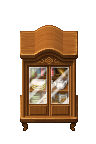
In the end I just had to adjust some details, added handles and hinges (both edits of parts of the first door in the door1 sheet) and a shadow to the top: as the object stands right next to a wall it is possible to add the shadow there.
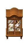
Now only the shadow below the object was missing, some black color, set to 50% opacity and here we go:
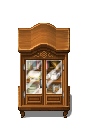
All in one-gif:
 Bonus: Turn, turn, turn!
This is even simpler than the object above, but it felt important to add it as well: Most objects just come front view, which limits your room design a lot. Turning an object around is an important skill to add more options to your map designs and it is not as hard as most of you think! As I didn't need the dodge/burn-tool or other fancy stuff, this object (beside the shadow in the end) was created in Graphicsgale,
My object of choice was the "wooden throne" - it is not as simple as a shelf, but has no complicated parts that would require redrawing when being turned.
Back view:
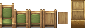
Since the back of the chair is much higher than the seat this is a pretty easy edit. The backrest is moved down by the height of the seat and filled wit a wood structure. Make sure that the wooden stils on the sides are continous. If you can't draw/pixelate wood grab the structure of another object (the right one in the picture) and adjust the color - done.
Side View:
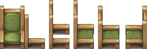
Reuse everything you can reuse first - in this case everything besides the seat. But that was no problem, was we can take the green part of the backseat and edit it slightly. Then I adjusted the proportions to the different perspective. When mirrored try to adjust the placing of the lightsource.

本贴来自国际rpgmaker官方论坛作者:Avery处,因国际论坛即将永久关站,为了存档多年珍贵资料,署名转载到本论坛存档,由于官方帖子为英文原帖,需要中文翻译请点击论坛顶部切换语言为中文就可以将帖子翻译成中文浏览,方便大家随时查看,原文地址:
https://forums.rpgmakerweb.com/threads/tileset-edits-for-rmmv-some-basic-things.70043/ 简体中文
简体中文
 English(英语)
 日本語(日语)
 Deutsch(德语)
 Русский язык(俄语)
 بالعربية(阿拉伯语)
 Türkçe(土耳其语)
 Português(葡萄牙语)
 ภาษาไทย(泰国语)
 한어(朝鲜语/韩语)
 Français(法语)

 聊天机器人
聊天机器人




 窥视卡
窥视卡 雷达卡
雷达卡



 发表于 2026-7-8 14:48:41
 提升卡
提升卡 置顶卡
置顶卡 沉默卡
沉默卡 喧嚣卡
喧嚣卡 变色卡
变色卡 千斤顶
千斤顶 照妖镜
照妖镜