Forests are probably something that many games contain, but also something that is really difficult for many to nail.
Since this is such a large and time-intensive topic, I decided to split it up and start with a prelude/spin-off that many of you might find helpful.
My
previous tutorialworked with the default tileset only, and for this part of the tutorial I’ll pretend it is all I can use for now.
But we will have a look on how to create realistic, good looking variation with minimal effort.
The reason for the limitation is to show you how to get the most out of a limited variety, especially with paid packs like FSM I see a lot of very boring forests (sorry, no offense), but this also affects any limited set or single type of tree.
So for testing purposes, I made a map with the larger of the two default trees only.
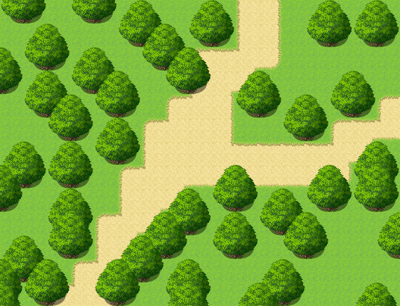
By spacing them out unevenly, having them overlap and trying to avoid patterns I got something that is a little more interesting to look at than just the default trees next to each other over and over,
But still, this is not a great map.
And I also fooled you a little, since this was not made by using tree from the OutsideB sheet, I made a new one that looks like this:
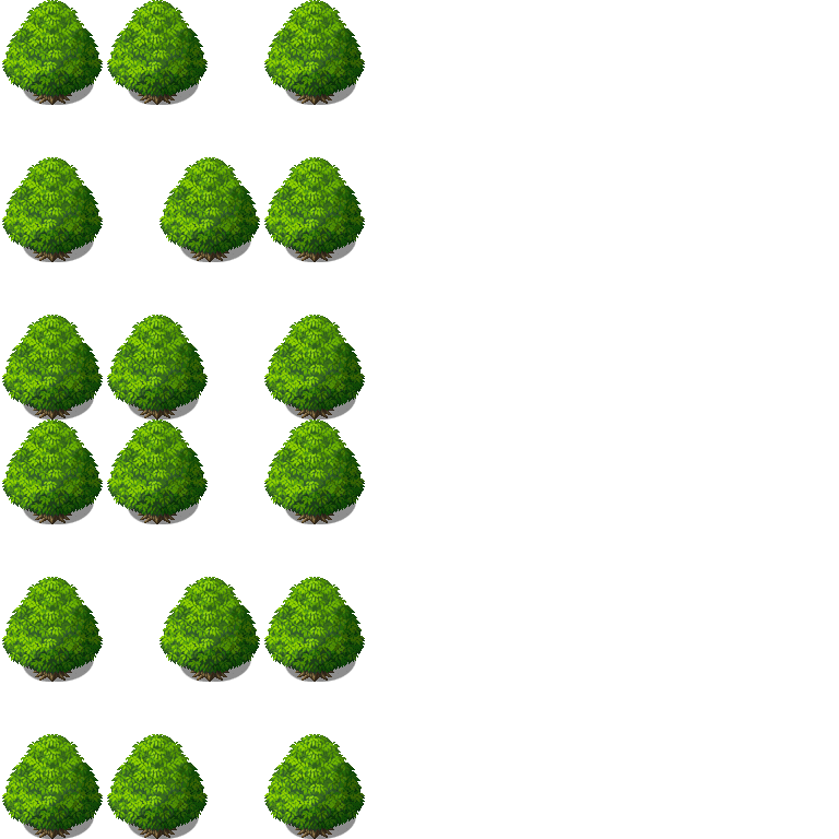
Because, let’s face it: if we use limited tilesets, we don’t need all the space on B/C/D/E by default. For example, Outside has B and C, but I can add a full D and E as I wish! And by optimizing my set and removing everything that I don’t need for forest maps, I can get even more space! What we might need that for and how to get even more space will be something to talk about in part 2.
But for now, you might have noticed, my set is a little weirdly spaced out, that is because my plan is to simply rearrange the trees!
Tip 1: Placement
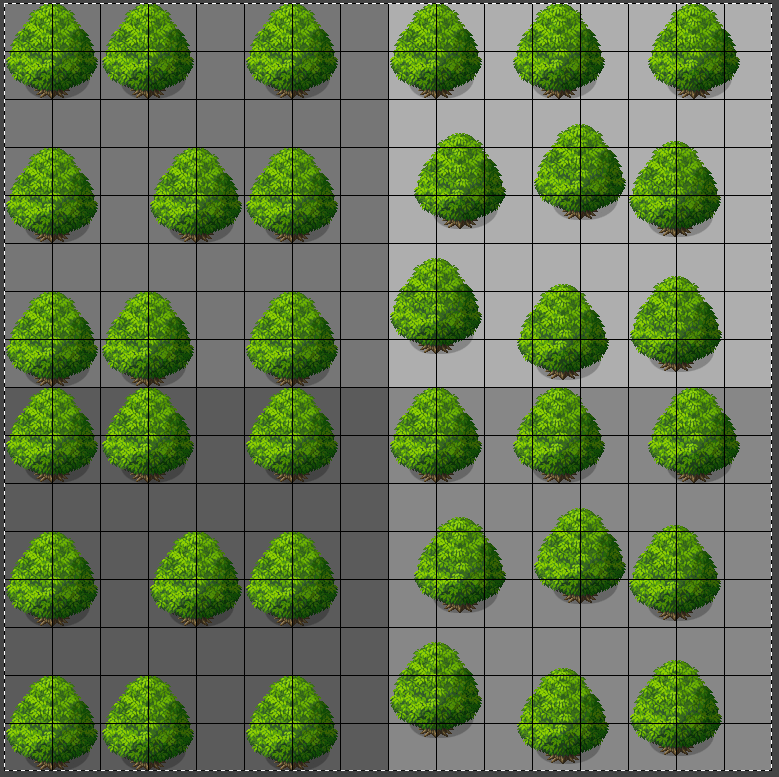
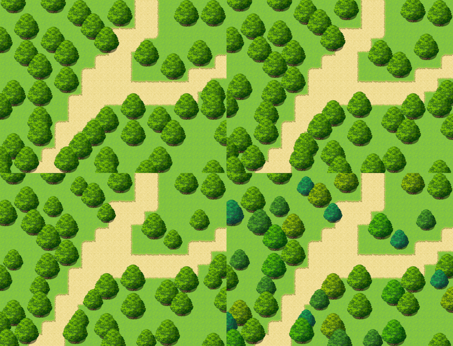
(left before, right after, lower half is just a duplicate of the upper half)
By simply cutting and pasting and using the grid as a guideline, I gave 8 trees a new position. You can do more or less, but I tried to place them in a way that I can still add proper passability to them for my party to walk around. As you see, I have the exact same lower half, which we will take care of in the next step. But before, let us have a look at the map and how this little 5 minute edit affects it:
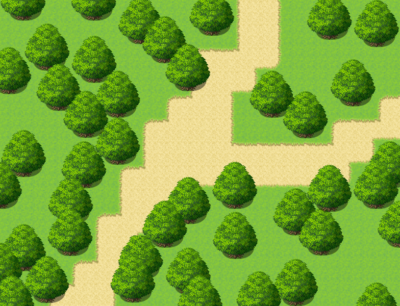
All of sudden, the trees are not in lines anymore, and the diagonal slope that we had in the lower part of the path turned into a more natural curve.
All that was needed was a little copy and paste and the tree placement already looks a lot less planned and more organic!
Do we have another 5 minutes for our tree tileset? If so, how about…
Tip 2: Size
Scaling is always a little difficult and for pixelated styles like time fantasy it might not even be a valid option. And while upscaling usually leads to blurriness, a little downscaling can do a lot for variety!
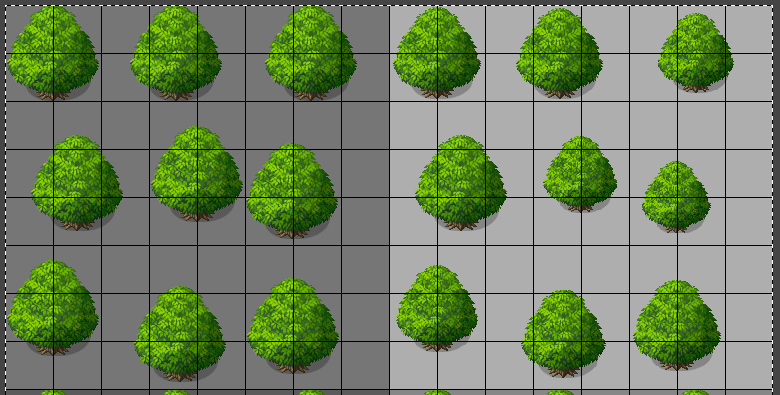
(left before, right after)
I left my lower half untouched, as I just wanted about half of my trees to be smaller, and not all by the same ratio. Therefore, I cropped and pasted each of them and played with “Scale Layer” on the reinserted tree until I had a size that was fitting for me. There is just a little variation to get here, as you can really mess them up by making them too small, but you get at least a little wiggle room and some nice options.
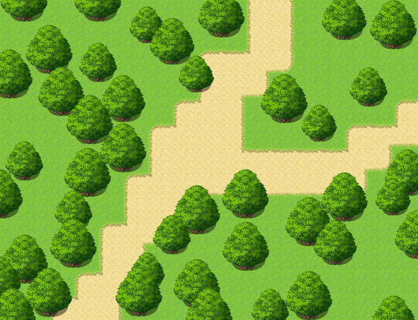
And just like that, the map transformed again!
Time to see if we have another 5 minutes for
Tip 3: Color
You probably guessed this one from the start, it is so easy and yet often overlooked!
We don’t have to make every tree another color, for my test set here I worked in groups of three or four that I selected with the box selection and then just slightly changed in hue and sometimes saturation.
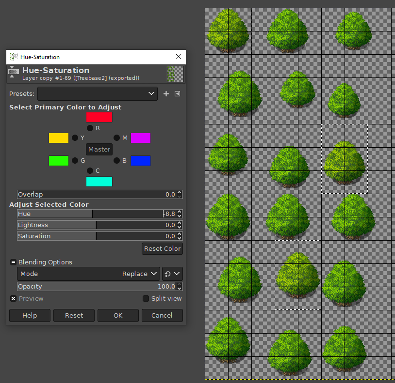
As you can see, the difference is not that huge, it will help to make the forest look connected and yet more interesting as if it was all one color. You can go in both directions, yellowish and bluish for more options.
My final set therefore looked like this:
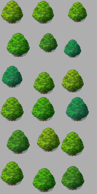
And by using it on my map, it leads to this result:
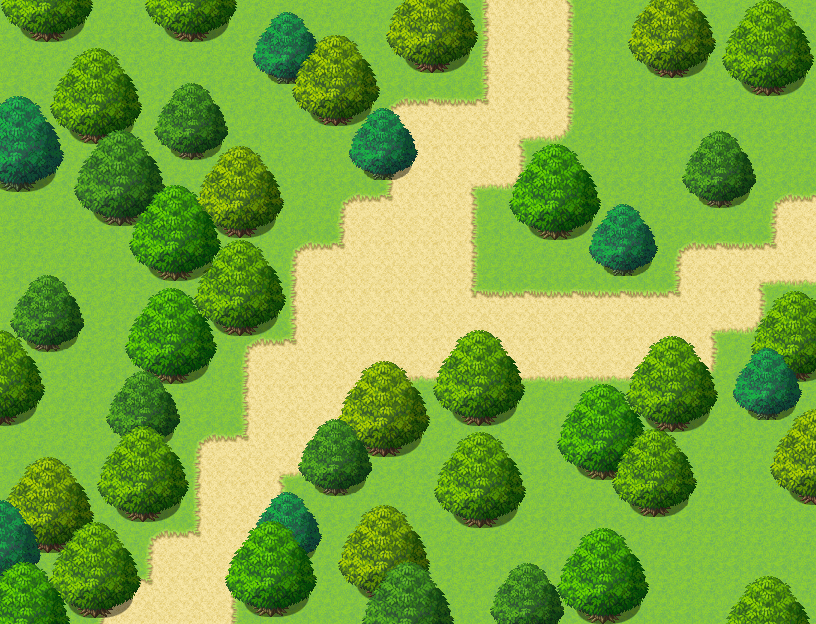
As you can see, the map we started with was not that good, and this one isn’t a final one I’d use either, but one is visually more interesting than the other for a reason.
Those techniques do not have to be limited on trees - with just little changes in placement, size and color you can break up patterns that might emerge from only having a limited range of clutter to choose from for your maps! especially things that can be walked on do not have to be placed on only a single tile of your grid and can help make your game’s maps more natural!
本贴来自国际rpgmaker官方论坛作者:Avery处,因国际论坛即将永久关站,为了存档多年珍贵资料,署名转载到本论坛存档,由于官方帖子为英文原帖,需要中文翻译请点击论坛顶部切换语言为中文就可以将帖子翻译成中文浏览,方便大家随时查看,原文地址:
https://forums.rpgmakerweb.com/threads/how-to-make-a-beautiful-editor-made-forest-part-1.156368/ 简体中文
简体中文
 English(英语)
 日本語(日语)
 Deutsch(德语)
 Русский язык(俄语)
 بالعربية(阿拉伯语)
 Türkçe(土耳其语)
 Português(葡萄牙语)
 ภาษาไทย(泰国语)
 한어(朝鲜语/韩语)
 Français(法语)

 聊天机器人
聊天机器人




 窥视卡
窥视卡 雷达卡
雷达卡



 发表于 2026-7-7 19:56:59
 提升卡
提升卡 置顶卡
置顶卡 沉默卡
沉默卡 喧嚣卡
喧嚣卡 变色卡
变色卡 千斤顶
千斤顶 照妖镜
照妖镜