This is so far the final part after the
round cave walls and
part I of additional edits.
So after you are done: is there anything left which you would like to know about in a possible part III? If so, what would it be?
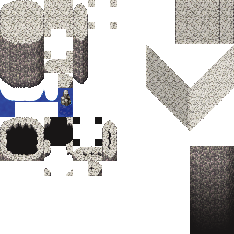
We left at this point in our first part of this tutorial (or the second, if we count the round cave walls). These already enable us to make much more interesting caves than before, but there is always room for expansion - especially since there are so many empty tiles on this sheet!
Let’s fix this!
If you want to go “all natural” on your cave you might have a problem when it comes to passing water or other obstacles without a man built bridge.
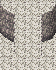
For a vertical bridge you don’t need any additional tiles, but sideview…
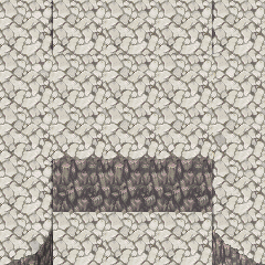
well, that looks off.
Luckily, that is a very doable edit!

Use a hard-edged eraser tool and “follow” the rock structure to create a bridge-like texture.
You need two rounded parts for the side and a middle part that loops, so you can create bridges of various lengths!

Just do some quick mockups to make sure they really do tile!
For the next step I will use Gimp.
Create a layer with your bridge and a second one via “duplicate”.
Recolor the duplicated one so it is darker than the default one:
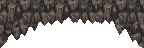
Now you can use a (former black) layer mask, the white brush and the smudge tool give your default bridge a neat bottom shadow outline.
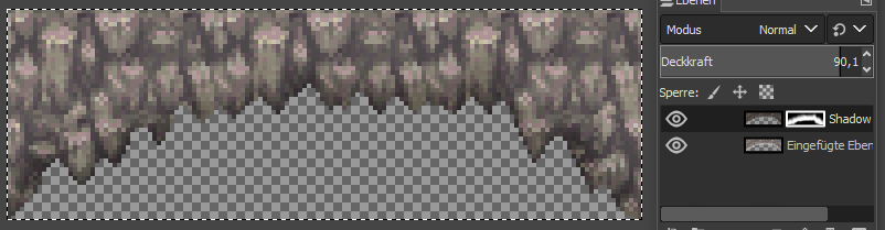
Here a quick comparison of before and after:
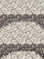
And this is already it!
We can now add the rock bridge to our set!
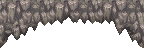
And the result is a neat and safe passage!
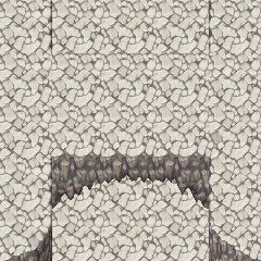
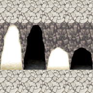
What the default RTP offers is by far not bad, but on one hand I prefer doors that are a size in between these two AND since these are made to match all cave walls, something that works better with the rocky texture.
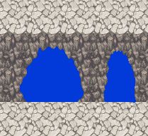
For a good start, use a seperate layer and a hard-edged pen to draw the shape of your door. I personally picked a medium height and made two different widths so I have some variation to choose from.
Make your layout in Gimp:
One layer background wall and floor to make sure your doors match perfectly.
On top of that create a layer group and give it a layer mask that looks like this:
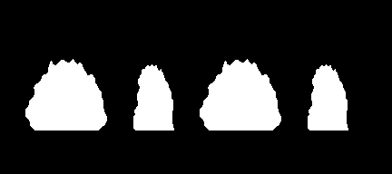
This will enable you to work within that group (that works like a folder) and everything that is outside your door shapes is cut off.
Your layout should look something like this:
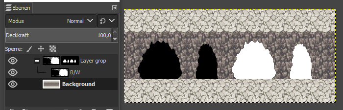
The B/W shape is just some plain color to make the shapes visible.
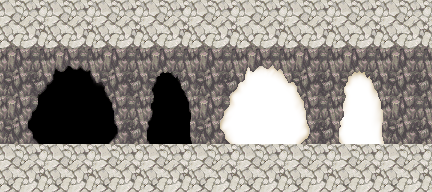
Now use desaturated yellow on the light to soften the edge. For the dark one you can use a darkened version of the wall and a layer mask.
This should be done on a seperate layer in your layer group and you can play around until you have a look you like.
For a perfect ground transition copy a strip of the ground tiles into your layer group as well:

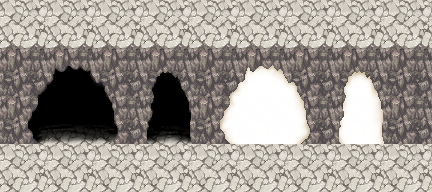
Give that layer another layer mask and use the brush and smudge tool to get a soft transition for your “dark doors”.
For the light ones, make a quick edit out of your default light door.

copy and paste the lower part to get a wider version of it and simply copy and paste that into your layer group:
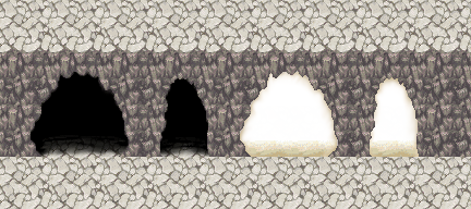
Of course you can soften up that transition as well with the ground tiles layer and its layer mask.
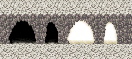
Summarized, I have 4 layers in my layer group:
B/W:

Edge for light:

Edges (with a layer mask that just includes a few pixels at the rim):
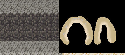
Floor (with a layer mask that is all white on the bottom and smudged to the top for a smooth transition):

And that all merged together results in this:
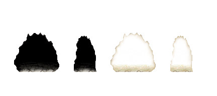
If you want to get closer to the “pixelated-y” look of the RTP you can now limit the color range of that document or copy it into the (already indexed) Dungeon B to bring it to the same color palette:
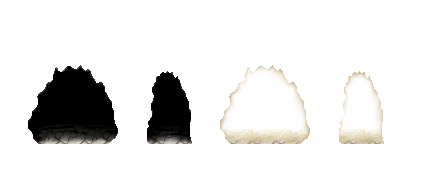
And done!
PS:
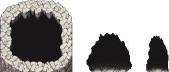
If you used a dark grey for the “surrounding darkness” as I did, you can use that as background color instead of black, that will make your doors blend in even better!
So, this cave may have had humans passing them or there are other mysterious reasons why there are stairs here. Stairs are just something very practical… but they are not as easy to make for caves as they are for normal floors due to the natural shape.
Anyways!
We are going to start with vertical:
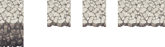
Seperate the edge of your cave wall and then smooth it out by moving and adding some pixels.You want a height of around 7 pixels for the wall part and the edge to be as straight as possible while looking natural. You want to copy two of these tiles next to each other.
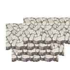
Create the stair shape by copy and pasting this part on top of itself several times, using a vertical offset of 12 pixels and a random horizontal offset to make the structure look more natural.
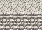
Your result is a good-looking looping stair tile!
Give the stairs an edge by “closing” the rim and making it darker.
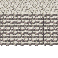
and there you go:
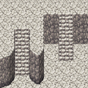
These are all the combinations you might want to have:
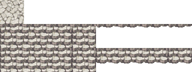
the altered ground so the stairs fit on the upper edge, the stairs with all edges and the edge not around the upper step (you can see why on the right example in the mockup) and two different bottom parts so these fit all possible lengths.
Now for sideview:
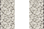
The side parts from our “top” are already a great base.
Use the 8px wide strip of the edge and place it with some vertical offset next to each other three times.
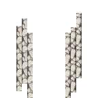
Take off the parts on the top and add them to the bottom:
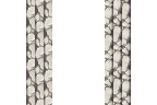
Now “close off” the top and bottom in a slightly rounded way:
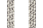
Now give the steps a vertical offset of 8 pixels each:
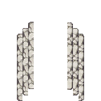
Now it is time to duplicate the stairs and add them to each other:
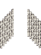
Bring them into this format and you are already pretty close to finish:
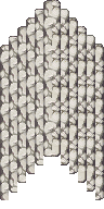
This is how these tiles would look like in game:
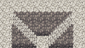
There are two things you might want to adjust:
The stairs on the left need a matching shadow and the bottom part of the wall needs an adjustment for the last step.
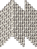
For the shadow, add a darker strip on the right side of each step. make sure to make two versions, one where all steps have the shadow and one where the one on the top has none.

For the wall, just round off the middle part of the wall a tiny bit on the edges.
And done:
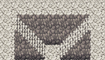
With these, your cave has again got some new options and you have more layout possibilities!
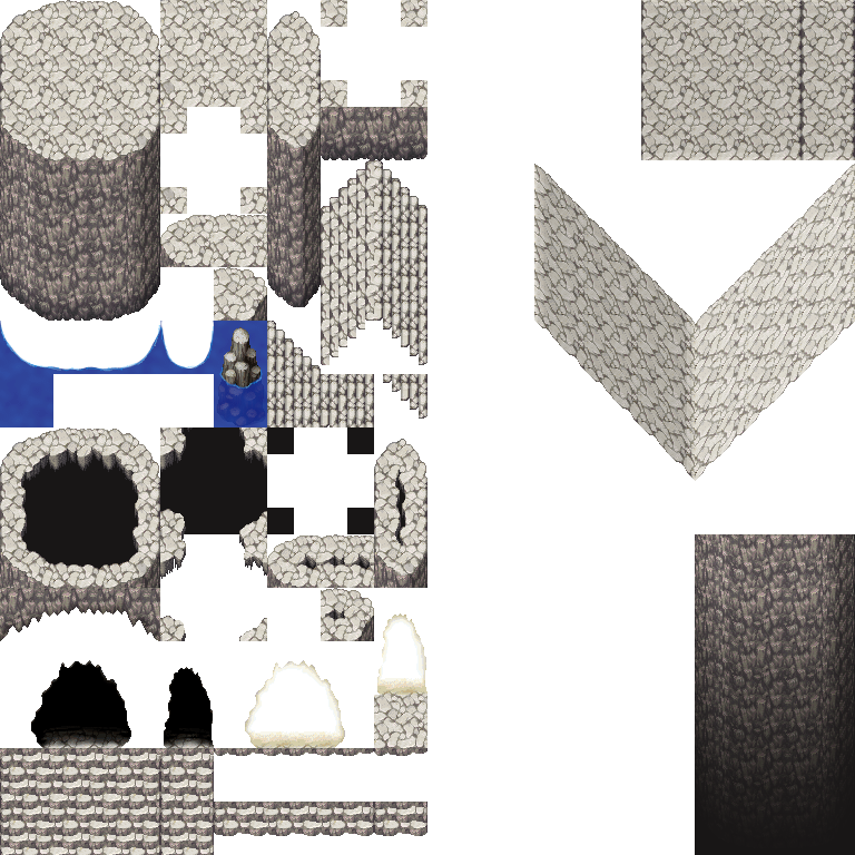
本贴来自国际rpgmaker官方论坛作者:Avery处,因国际论坛即将永久关站,为了存档多年珍贵资料,署名转载到本论坛存档,由于官方帖子为英文原帖,需要中文翻译请点击论坛顶部切换语言为中文就可以将帖子翻译成中文浏览,方便大家随时查看,原文地址:
https://forums.rpgmakerweb.com/threads/some-more-neat-edits-to-make-your-caves-nicer.156241/ 简体中文
简体中文
 English(英语)
 日本語(日语)
 Deutsch(德语)
 Русский язык(俄语)
 بالعربية(阿拉伯语)
 Türkçe(土耳其语)
 Português(葡萄牙语)
 ภาษาไทย(泰国语)
 한어(朝鲜语/韩语)
 Français(法语)

 聊天机器人
聊天机器人




 窥视卡
窥视卡 雷达卡
雷达卡



 发表于 2026-7-8 07:50:58
 提升卡
提升卡 置顶卡
置顶卡 沉默卡
沉默卡 喧嚣卡
喧嚣卡 变色卡
变色卡 千斤顶
千斤顶 照妖镜
照妖镜