There are things that look kind of funny but also bad, and there are easy ways to replace and avoid them. The links are just the first things that came to my mind, there are probably more options out there. Feel free to suggest other problems and alternatives!
Doors that wouldn't even suit hobbits
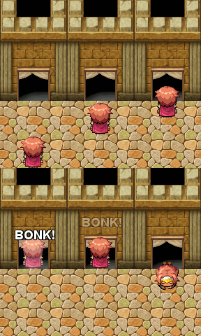
To be honest: they look so bad, I can't understand how some can stick to them. It's not only the size compared to the characters, but also to the walls themself! I mean, in which world is a Wall two times higher than the door?
Alternatives:
Maru's large doors#2
Avery's all directional large doors
Indrah's large doors
Crazy_Leen's large doors
Horses that can't even carry a rider

Well, if you look at the gif you know what I mean ;D
Alternatives:
Maru's large horses
Avery's large horses
Use a recolored RMXP horse instead (if you own RMXP)
Blocky cave walls

Blocky cliffs are something you can get away with in retro styles with not much details - but the default tiles are too detailed and realistic for that!
There are a lot of alternate walls out there and it just improves the look so much!
Avery's round caves and cliffs#2
Maru's round Ice cave and better cliffs
Celianna's round cliffs
Sturmfels' round cliffs
Small tiles

You can get away with minor size problems, but sometimes the problems are HUGE.
What can you do?
There are many resizes (for example Maru has a helicopter and trees and I have a car, truck and tank), but there are too many things to be listed that could be adjusted.
If you notice something looking off, do a little research and/or make a request, you can most definitly be helped!
Bad tile placement
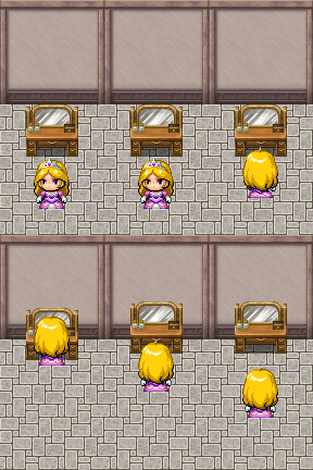
This is something very basic, the tiles are placed in the set to have as many tiles fitting in it as possible - but, who places a shelf 50cm from the wall? (exactly, noone)
What can you do?
Sort the sets a little, throw out the things you never need and adjust the placement. It enhances the look so much with so few skill!
All you need is Gimp and it's grid functions ;3
Here is a tutorial by Indrah that shows some basics:
https://rpgmaker.net/tutorials/696/
本贴来自国际rpgmaker官方论坛作者:Avery处,因国际论坛即将永久关站,为了存档多年珍贵资料,署名转载到本论坛存档,由于官方帖子为英文原帖,需要中文翻译请点击论坛顶部切换语言为中文就可以将帖子翻译成中文浏览,方便大家随时查看,原文地址:
https://forums.rpgmakerweb.com/threads/the-things-that-make-an-rtp-based-game-look-bad-and-alternatives.97882/
 The things that make an RTP-based game look bad - and alternatives: The things that make an RTP-based game look bad - and alternatives-5.gif
 简体中文
简体中文
 English(英语)
 日本語(日语)
 Deutsch(德语)
 Русский язык(俄语)
 بالعربية(阿拉伯语)
 Türkçe(土耳其语)
 Português(葡萄牙语)
 ภาษาไทย(泰国语)
 한어(朝鲜语/韩语)
 Français(法语)